Transforming Credit Education with the Consumer Financial Protection Bureau
Product: Mobile-first educational web app
My role: UX Research + Design | Content Strategy
Timeline: 12 weeks
CONTEXT
Team: 4 UX Designers, 4 Software Engineers, 2 Data Experts
Client: The Opportunity Project with the Consumer Financial Protection Bureau
Tools:
Enhancing credit card competition to empower consumers
The Consumer Financial Protection Bureau (CFPB) aims to promote competition in the credit card market, empower American consumers to make informed decisions when selecting credit cards, and reduce the staggering $120 billion in annual credit card interest and fees.
CHALLENGE
Lack of financial literacy leads to unimaginable debt
Our research revealed that many people, especially young adults, lack a clear understanding of how credit cards work, leading to confusion and debt. To address this, they need a simpler way to learn about credit cards before comparing and choosing the right one.
PROBLEM
An educational tool for understanding credit cards
Our solution, CreditHike is an educational tool that enhances financial literacy by simulating the credit card ownership experience. It empowers users to make informed decisions about their financial well-being before selecting their next credit card.
SOLUTION
Strategic research delivers deep insights
Our team's comprehensive research plan, involving users and key stakeholders, deepened our understanding of user needs and the credit card landscape, steering our product toward an educational focus.
RESEARCH METHODS
4
Competitors Analyzed
Reviewed popular credit card comparison tools on the market
5
Comparative Tools Analyzed
Learned about alternative comparison tools from other industries
72
Online Survey Respondents
Quantitative data allowed for a broad understanding of user experiences
7
Users Interviewed
Qualitative data helped identify specific pain points and needs
4
Advocates Interviewed
Learned more about various target audiences and the problems they often face
2
Usability Tests on Existing Tool
Watched how users currently interact with card comparison tools
Narrowing our target audience to 18-23
To better understand how people research, compare, and choose credit cards we conducted an online survey which reached 72 respondents over 5 days. 77% of survey respondents received their first credit card between the ages of 18-23, followed by 20% between ages 24-39.
SURVEY
Users find educational tools helpful
Respondents said the most helpful tools when comparing credit cards include:
Users want to go back to the basics
In this pivotal phase of our research, we discovered that most users lack educational resources, feel overwhelmed when comparing credit card options, and are generally young yet motivated to expand their financial literacy.
INTERVIEWS
User pain points:
“Credit card comparison sites use all these big words about interest rates and returns and all this stuff. I don’t know what any of it means.”
User goals & needs:
The Financial Seedling
As a way to synthesize our survey and interview data and build empathy for specific user needs, we developed the user persona, the Financial Seedling.
PERSONA
19 Quizzes Influence Product Direction
Research led to a unanimous focus on games, quizzes, and journey type experiences. Emphasis was on teaching, not testing, and using a scaffolded approach. To compare similar tools, I tasked the full cross-functional team to research online quizzes resembling guides for users in making choices or purchases. In total, we compiled 19 examples which informed our initial sketches and concepts.
DESIGN
Crafting youthful charm through content strategy
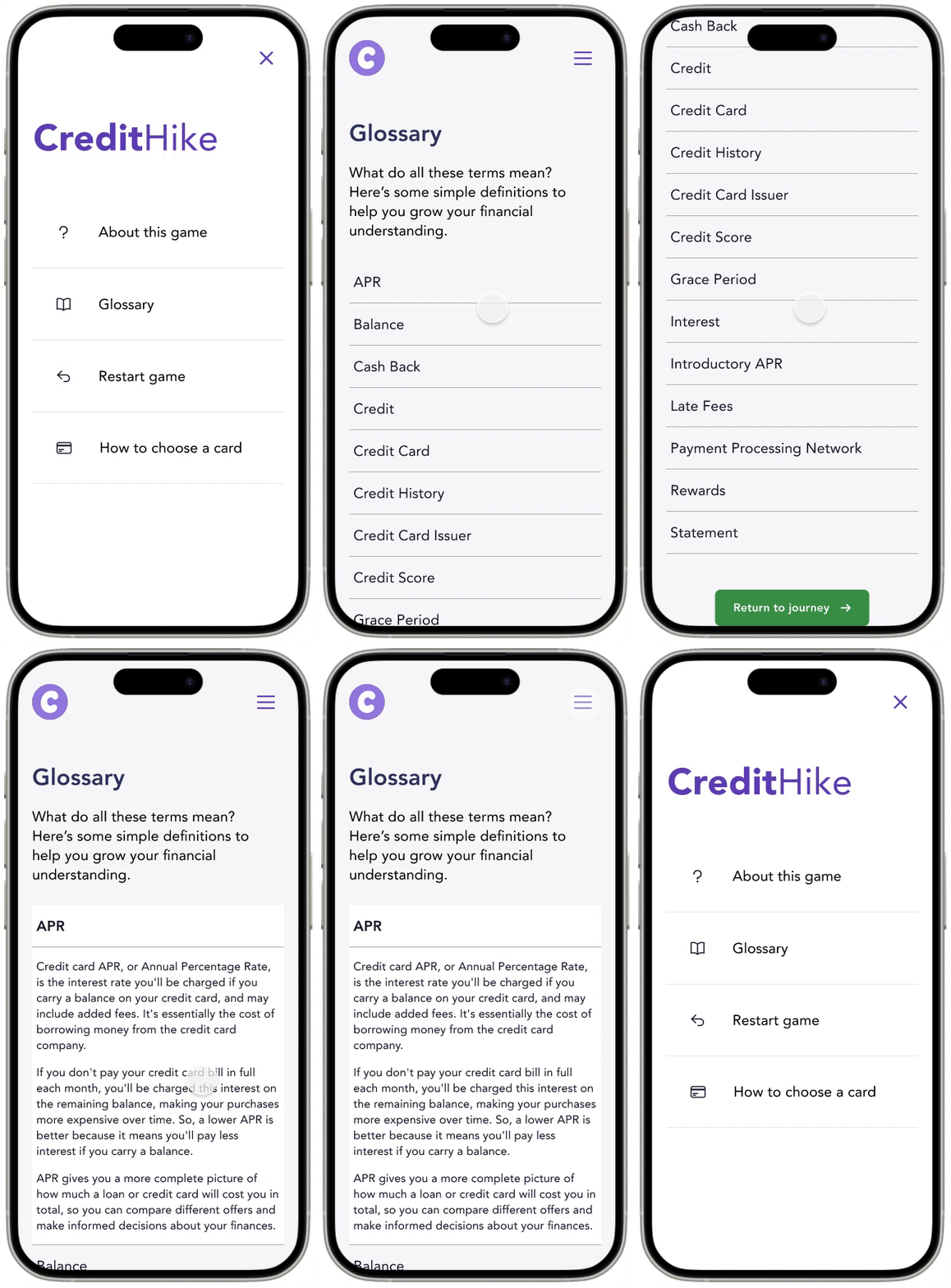
I played a crucial role in shaping CreditHike's content strategy, designing a friendly voice and visual style tailored to our young audience. Extensive research guided me in developing UX writing for screens, crafting a layperson's financial glossary, and infusing encouraging language. Additionally, I led the team in adopting a theme and contributed to hand-drawn icons, ensuring a delightful and on-brand user experience.
An educational tool that will teach, not test
Our solution is an educational tool, CreditHike, that allows users to expand their financial literacy through the context of a simulated journey through credit card ownership where they can learn how to make informed decisions regarding their financial future. Key features that we focused on to achieve this were a ‘Choose-your-own journey’ method, helpful ‘Learn More’ links, and a comprehensive glossary of financial terms.
SOLUTION
‘Choose-your-own journey’ method
Helpful ‘Learn More’ links
Financial terms glossary
UI updates to eliminate confusion
After working through wireframes, we built our mid-fidelity prototype. To validate our design decisions we conducted usability testing on our mobile prototype to uncover any areas of confusion. We were fortunate enough to be able to work with a group of young people from MyPath ages 18-25 years and conduct usability testing with 11 people.
USABILITY TESTING
Confusing Verbiage
When asked to decide what level of credit history they had, most users were not sure what that meant regardless of experience level. We opted to edit the copy and ask someone to approximate their credit score instead.
Lack of Onboarding
Helpful tools we had built in like "Learning Links" and the glossary were being missed by most users unless they were directed.
Since these elements were important for helping users increase their financial literacy, we opted to include an onboarding screen at the beginning of the journey.
Stark Colors
To our surprise, most participants suggested that we create a dark mode as our white background was too stark.
Although we did not have time to redevelop the tool in dark mode, we opted to at least change the background to an off white instead.
Continuing CreditHike’s journey
Usability Testing - Reconnect with MyPath for 2nd round of testing to validate our design decisions.
Expand User Journey Options - Develop the user flows beyond our target user.
Determine Metrics for Success - We’ll develop a plan for measuring the usage of the product once all aspects of the tool are built out.
Looking Beyond Netlify - Currently, our product is launched on Netlify but we would like to explore options for launching our product elsewhere!
NEXT STEPS


